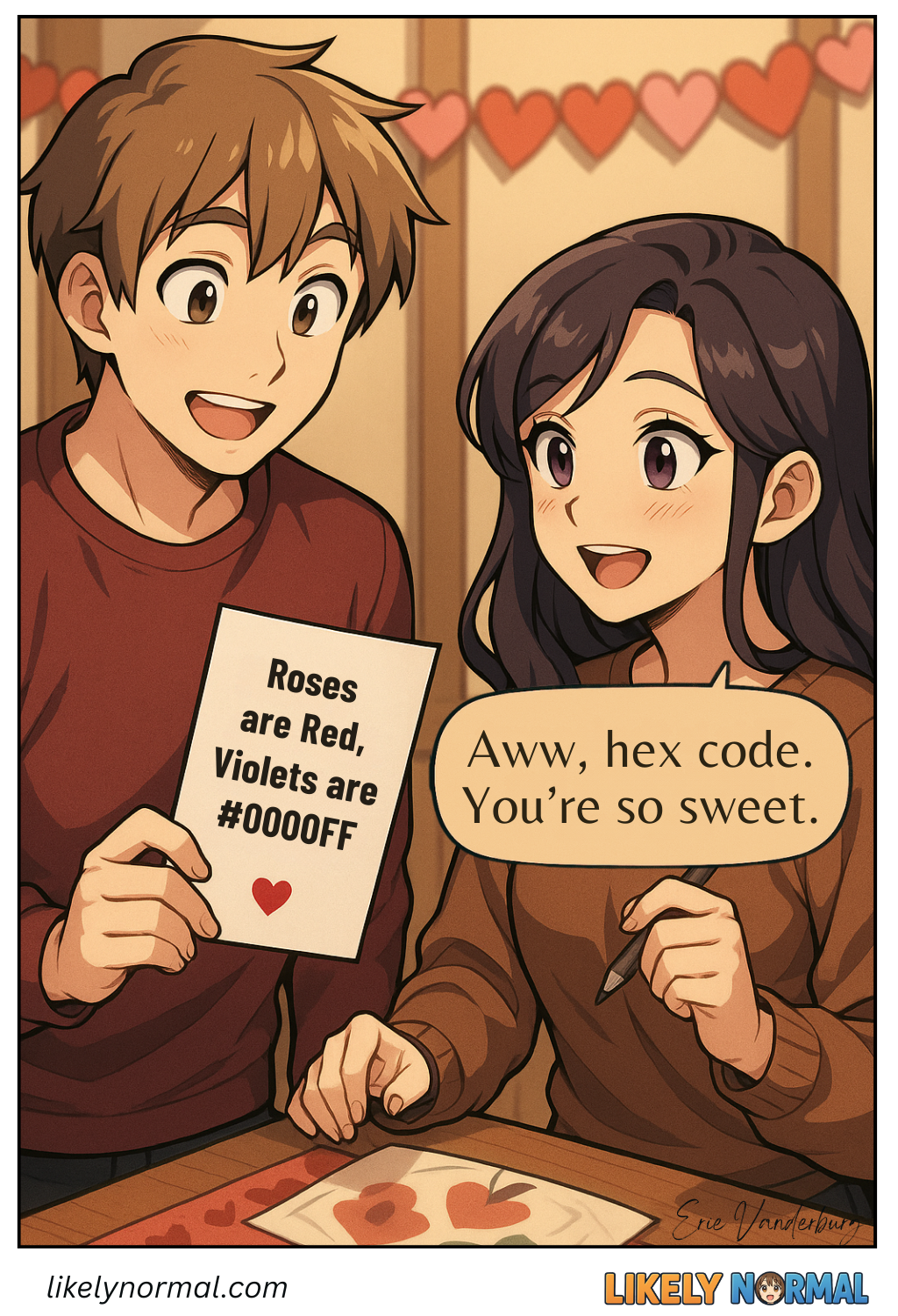
Graphic Design Valentine
Hexadecimal color codes are one of those things that make perfect sense once you’ve lost all will to question them. At first glance, they look like the result of a keyboard smash—#FF00FF, #C0FFEE, #BADA55—yet somehow, these cryptic combinations translate into every shade imaginable, from “vibrant magenta” to “corporate blue that says ‘trust us’ but also ‘we have no personality.'” The system is simple, in the way that advanced calculus is simple: red, green, and blue values are expressed not in sensible numbers, but in base-16, a counting method where the digits go from 0 to 9 and then, just when you think you’ve got a handle on things, A-F barges in like an uninvited guest.
This means #FF0000 is the reddest red, the kind of aggressive crimson you’d use for an “EMERGENCY” button or a “50% OFF!!!” banner that’s actually just 10% off. #00FF00 is green at full blast, a shade so intense it looks like it should come with a radiation warning. And #00FFFF is cyan, the default filler color for gradients when you can’t be bothered to think of something more original. Mix them together, and you get abominations like #FF00FF (magenta, the unofficial color of 1990s WordArt) or #FFA500, which is orange—because apparently, someone decided that naming colors after fruit was a good idea.
The real fun begins when you realize web designers have spent years memorizing these codes just to sound impressive. Normal people see #E6E6FA and think, “Hmm, light purple?” A designer sees it and declares, “Ah, lavender—but is it too assertive for our wellness brand?” There’s an entire spectrum of absurdly specific shades out there, like #F5DEB3 (wheat), #8B0000 (dark red, or as I like to call it, “regret”), and #D3D3D3 (light gray, the visual equivalent of elevator music). And let’s not forget the passive-aggressive inside jokes, like #DEADBF (a gloomy pinkish-gray) or #FACADE (beige, perfect for websites that are, indeed, a total façade).
At some point, humanity tried to simplify things by using actual color names—cornflowerblue, papayawhip, goldenrod—but this only made things worse. Now, instead of arguing about hex values, we argue about whether “darkseagreen” is too dark or if “mistyrose” sounds like a rejected Crayola color. (It does.) So we’ve all quietly agreed to return to hex codes, where #C1C1C1 is definitively, unquestionably a slightly different gray than #C2C2C2, and anyone who claims otherwise is lying.
In the end, hex colors exist to make designers feel like they’re part of an elite cabal. They’ll casually drop, “I darkened the hover state from #2E8B57 to #2D8B56,” and you’re expected to nod solemnly, as if you can perceive the difference. (You can’t. Nobody can.) So the next time you see a sleek website with a soothing #F0F8FF (AliceBlue, whatever that means) background, remember: behind every great UI is a developer, bleary-eyed, muttering, “Just one more hex tweak…” And if all else fails, there’s always #FFFFFF (white)—the ultimate surrender of creativity.

Discussion ¬